Welcome to the Question2Answer Q&A. There's also a demo if you just want to try it out.
+9 votes
10.8k views
in Q2A Core by
edited by
Folks,
 
Snow 1.4-beta is ready to roll. Soctt will make it available soon.
 
I want to say thanks for all helps and supports provided during the development to below people
 

Since I have start to work on Snow Theme 1.4 and all development updates you can find on http://snow.q2amarket.com/

To know the next update keep checking the topbar information.

I have already created many questions with different typs of content to check the styling and all Q2A Core elements. However I also need help from the community to test the theme and add required conent to the development project.

Few things I need at the startup:

  • At least 50-100 users in the list so if you can register with it, that would be great help to provide the list.
  • If you think that I left any type of question which is important, Please post it so during the styling I consider it as well.
  • Need some more tags, Most of the tags I have created for testing but to check the tags list page need some additional volume of tags.

If you are creating any question for the theme style testing than please add to the Theme Design category, else you can use any random category.

Once theme is ready, I will publish the databse to the community which will helps to the theme developers for testing according to the Q2A Standards. However I will remove all email address from the database before publish it.

Thanks for your help and support

Go to the site


Update 140312

Here is the very first update for Topbar and Main Nav. I am combining both to keep new design trend and make more space available to the view area.

Login form will be moved same as MaxControl Theme login section. I am thinking to add JoyRide as well same as MaxControl theme.

Heading and title fonts changed from Arial to Ubuntu in Snow 1.4.

I wil deploy on development site on this Saturday so you can test overthere.

I have just started and still long way to go, however feel free to provide your feedback by the time and if possible and fitting with my design concept I would try to consider it for this version.

Snow 1.4 Update


Update 140515

First of all sorry for being delay due to some other priority works.

You can see some more update on demo site. I have added sidebar for moble and changed main navigation menu for mobile.

Please let me know how it looks with Mobile?


Update 140529

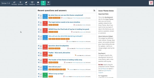
Folks just updated the dev version, please check and provide some feedback

URL: http://snow.q2amarket.com/
by
Jatin, I think there is an issue with the email address confirmation.
I did not receive a link to confirm my email address but this string :
"[emails/to_handle_prefix][emails/welcome_body]"
by
Yes, I had the same as maxj, I'm guessing the language file is messed up.
by
No link to confirm my email insite the e-mail message I received.
Message : "[emails/to_handle_prefix][emails/welcome_body]"
by
There is a problem. Bug.
I'm administrator in the settings, All new users must confirm their email: Enable
I registered on this site. If I accidentally gave the wrong e-mail I can not change the email address. It is not active. A poster asks to activate the mail. But I can not change. Can fix this.
by
Sorry folks, Yeah I found the same. I have re uploaded all files and problem resolved. Please do needful to re-confirm the email address. This is just to avoid all hell spams (@webmail.com ppl)
by
This is just for knowledge. The issue may be occurred due to some missing language files. So probably it was not changing the parse key to the language string.
by
Thanks, now it works !
by
Okay cool.. :))
by
Why there is large free area in left side?
by
right click and open image in new window :))
by
Got it. Sorry for my knowledge. Nice balance. I like it.
by
There is no problem at all.. :))
by
Folks, Thinking to drop support for IE8. Please provide me your feedback regarding this and how many users still using IE8.

I am still in favor of updating to IE9+ and drop support for IE8

@Scott,
What is your thought about it?
by
Since XP has been discontinued, I'd discontinue IE8 too.
However, if I look at usage data, I can see that  IE8 has still a major presence.
Last year :
http://gs.statcounter.com/#desktop-browser_version-ww-monthly-201303-201403-bar
Last 3 months :
http://gs.statcounter.com/#desktop-browser_version-ww-monthly-201401-201403-bar

(similarly to XP ... http://gs.statcounter.com/press/less-than-a-week-to-go-and-xp-remains-worlds-second-most-popular-operating-system ).

Personally I would evaluate the drop of support considering also the effort that it would require to mantain it : negligible ---> mantain it; significant ---> drop it.
by
@maxjtechno, Thanks for the statistical reference. Myself prefer to keep things updated to get advantage of new technology. Even IE8 is so older (since XP I believe) and now there is IE11 version.

In reality people will keep using since they will get support. At one stage we have to stop support with the same reason I said above. Also to provide support out dated browser takes extra time in development (As everyone know that).

Even Google now automatically drop support for older browser and supports only latest browser. (This may be because they are always using new/latest technology in their products and APIs)

=================================================
November 6, 2013
Google Drops Support for IE9

The Google Apps blog announced that Google will drop support for Internet Explorer 9, now that Internet Explorer 11 is available. "We support the latest version of Google Chrome (which automatically updates whenever it detects that a new version of the browser is available) as well as the current and prior major release of Firefox, Internet Explorer and Safari on a rolling basis. Each time a new version of one of these browsers is released, we begin supporting the update and stop supporting the third-oldest version."

Ref link: http://googlesystem.blogspot.com/2013/11/google-drops-support-for-ie9.html

===================================================

Microsoft also dropping supports on XP and will be notify their users to upgrade the version of Windows. http://www.microsoft.com/en-us/windows/enterprise/end-of-support.aspx

Also some of their products itself doesn't support IE8 http://community.office365.com/en-us/w/manage/office-365-and-internet-explorer-8.aspx#ie8

Another ref: http://theie8countdown.com/join-the-cause

Myside: I have already dropped support for IE8 for all my products (including Q2A, WP and Other Designs) and all new and upgraded versions will only supports modern browsers.
by
I'd like to keep good browser support, especially since IE 8 still has significant market share (unfortunately). It doesn't need anything fancy, just as long as the layout isn't *completely* screwed up.
by
@Scott,

Thanks for your feedback. Okay so I will write IE8 specific CSS for this version.
by
Please check Update 140515 on Quesiton
by
sorry to say this @jatin_soni, from my personal view the new update for mobile is just not looking good. The previous way of sliding menu was much better and attractive. On the other hand the sidebar could be at the last of the questions as in a q2a website on mobile, no one would like to see the description of the site first and the questions. The questions should always be given first priority to be shown on the mobile.
by
@Gurjyot Singh,

Thanks for the feedback. Since for now I may keep the menu as it is for now. However, if I get time or change my mind than will change to the sliding menu.

The sidebar is hidden and so doesn't matter either it is at the end or on the top or on the side(hidden).

I have to design theme to cover maximum devices and requirements and so may have to compromise for some features.

As I said before, I am now considering it as a project so it will keep update and will try to get feedback from you all users after 1.4 released. This will helps to fix some initial bugs and make it better. So due to my busy schedule the first target is to make it fairly looking good and responsive so all user can start to provide mobile support to their users.

I really need feedback and appreciate that too and so I also may open one dedicated section for Snow Theme feedback later released.
by
@jatin_soni I appreciate your work, and if I would have seen this change on the first hand then I would have liked it, but at present its like we were at a better stage and now we have came two steps back.
The second thing you say that the sidebar is hidden, but in my mobile it is shown to me. All the widgets in the sidebar is showing in the main site. But the order of things have changed, they are like
site description > Question, answer count widget > All categories > Most Popular tags > Menu > Recent Questions and Answers > Footer
The sidebar is not hidden at all.
by
@Gurjyot,

Actually, for mobile I am using qa_is_mobile_probably() and so you may facing issue on desktop???

For the menu, I may restore the earlier one. I just wonder why it is working perfect with all my devices but not some of others.

Could you please add me on skype and if you can help me on testing during the development? I will PM you my personal skype id (not q2amarket)
by
Update 140529

Folks please check and provide your feedback http://snow.q2amarket.com/

FYI,
I may provide some options to set tags and some other colors, so just ignore if you don't like tags color.
by
Hi bro. Good job. But i like this is questions list example.
http://fotohost.kz/images/2014/05/30/UKITn.png
Orginal version:
http://fotohost.kz/images/2014/05/09/HvlQ.jpg
Question page.
http://fotohost.kz/images/2014/05/20/18Bs.jpg
by
Responsiveness : on an iPad, vertical orientation, the right slider effect (showing the right menu bar) does not work. The right menubar is visible (so the dimension of the page is bigger than the dimension of the display)
Layout : I see some "mess" in the titles and meta informations of the questions, in the question list (misalignment, positioning on a new line)
Question page : questions, answer and comments should be separated. Now I cannot distinguish them
by
@maxjtechno,

Thanks for the feedback,

I am still working on the part you mentioned and the q-view page is not yet started. I agree my mistake , I should mentioned what update I have done.

Also still not yet added media query for all breakpoints. If you guyz have breakpoints than please share with me. Else I am going to use only standard breakpoints. such as 320, 768, 1280 etc

For q-list tags and meta I am thinking to keep tags and meta side by side and  misalignment is just happens when there are more tags. Or I may set fix width of 50% for each.

Or you guyz prefer to keep both in separate lines?
by
On handsets I prefer to have tags and meta on separate lines (a la stackoverflow)
by
There are some updates, especially on footer section.... http://snow.q2amarket.com
by
Great. Design of Footer section is really attractive.
by
Yo the footer work is looking really good.
by
Glad to know you guyz like it :) some more update soon in couple of days..
by
Some more updates...

Pagination
Category Sidebar
Moved sidebar toggle for mobile from top to bottom
Other sidebar stuffs
Few other fix.

Next update will be question view page..
by
Observed. Really attractive. Thank you very much.
by
Some more updates.....Question View (q-view) page. Make sure it is not 100% done yet but very soon in next update. http://snow.q2amarket.com
by
I like that design...I think now we are very close to have this version..
by
More update on Q-View.

Please let me know your feedback about buttons and comment section
by
More update on q-view. Finished Mobile support.
by
More updates.... Please check the users page and tags page... http://snow.q2amarket.com/users
by
Both pages are attractive and colorful. I like that. But please tell me what is the symbol before the user scores?

On Q-View Page you have added only buttons for "Answer this Question" and "Add Comment". If you can provide an option to Admins to select "buttons" or "words".
by
by
@rgd, Symbol is just a points (coins) icon same as in user nav menu points.

For the actions icon and text, I may try to add this option but not so sure, at least for this version.

@sep, I don't understand what exactly your suggestion is. Can you please write few words to understand?
by
Folks, Theme is almost done and now testing and fixing different device size and some fine tuning.
by
Great news...Thank you.
by
Wooww .. Thats great news @Jatin . Thanks a lot .
by
you are most welcome.
by
[Update] [q-list] Question Lists for most device. Please check all question list in your device/s if it works properly.

Fix Sidebar issue: Move sidebar at the bottom (after content area) for desktop
Fix Menu for mid size where it was showing open in stake.
Change menu width to 100% for mobile device
by
How many RTL users are there for SNOW THEME ONLY. How much you can wait for RTL version???

4 Answers

+2 votes
by
Jatin can you make the menu bar as sticky bar. As well as elongate the footer so that more widgets can be added there. As well as some space for website description in the main space instead of sidebar, like most of the themes are providing now a days. Rest all your themes are worth a watch. So I'll be waiting for your next work.
by
Sticky Menu:

The menu bar is going to be sticky of course. This is not good news for people who don't like that, so I may give an option to make it sticky.

Widget Area:

The widget system is based on all registered places in the core. So core widget may not be available for footer. However I will see the core and if able to register footer area for widget I will do and send pull request to Scott and he will decide either implement or not. But I can create dedicated widgets to footer.

Description Space:

This can be done by adding separate home page or at the top of the content area. I need to find better space to do this. If you have any idea or reference feel free to share with me.
by
When I'll get to know something about description space I'll definitely convey to you.
But one thing I'll surely say that you should add something moving in this theme. Like at a place latest 5 or 10 questions are scrolling up or right to left or left to right.
In short something should be added in theme that could make the new snow theme way better. The theme should not look like a stagnant Web page, where nothing is happening on its own. But something something should be seen moving so that website should look that it's communicating to the user on its own.
by
i really agree with you on this one. Maybe a recent questions slider or a question slider where you can specify the number and type of questions that should slide
+3 votes
by

Update: 2

Just done topbar section for both desktop and mobile. Here are few shots from Galaxy.


That would be geat if you folks can just cross check on your devices and desktop just to make sure things are going well.

by
Moto G. Chrome browser. Kit-kat. The sidebar menu is not working. Great theme btw!
by
edited by
@Scott,

Does it open and close or not even that? If it is the issue with many than I might need to re-write the scripts for menu. Or may be as you said slide down menu. Butthe only issue with slide down menu is occupy entire vertical space when oopen and have to scroll down to close (in case don't select any item), wile in the side menu close button stays on the screen.

The sidebar area needs to be done and also I'm thinking to move to right (out of the screen, same as the menu).

@Ronlaw,
Not working at all or any specific issue?
by
Nothing happens when I click. The login button is working perfectly.
by
Some more updates.....Question View (q-view) page. Make sure it is not 100% done yet but very soon in next update. http://snow.q2amarket.com
+2 votes
by

Login button on iOS 7.1 seems different

by
@axpv,

Just wondering me why IOS devices getting trouble! Anyways, I will fix it soon. Thanks for help.
by
... also the button in the left corner doesn't work :( When I am press it nothing happens, it just highlighted and after few seconds highlightning dissappears. I am testing on iPhone 4S.
by
So I think this is the same issue as other reported for IOS. Actually I am anti-apple person :p but I think I have to have it now at least for the testing purpose. Let me try to find the resolution for the issue. Thanks again.
by
Thanks! :) Will wait for new Snow :)
+3 votes
by
More updates on Snow 1.4 please check it out. The update is done for QA List. which is almost done for all major devices and sizes.

I may post some mobile shots tomorrow.
by
Hi Jatin, Is it possible to download Snow responsive theme for testing?
by
Sorry.. it is not in that stage for testing.  Also it won't be available to download but once done, than will be included/replaced with the existing Snow theme in the package.

You can test done part at dev site.
...