Welcome to the Question2Answer Q&A. There's also a demo if you just want to try it out.
+34 votes
28.8k views
in Themes by
retagged by

Hello All ,

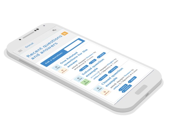
Donut is Lightweight , Fast , Responsive , mobile friendly , OffCanvas design , powered by Twitter Bootstrap coated with a sleek and minimal design . And more over it is free . 

Hope you will like this . 

Download This theme from Store 

See in Demo

Feel free to use it and report any bugs if you find . 

I have more good plans for this theme . This will be actively developed by me and add new features regularly . 

Stay tuned ..................... :) 

Features

  • Clean and minimal
  • Responsive Design
  • Light Weight and Fast
  • Inbuilt CDN support for base css and JS files , which boost up the site speed 
  • Cool Tooltip on hover on few elements 
  • and many more options

And many more useful features in pipeline for the newer version  . 

Whats new in 1.1 

  • updated navigation bar 
  • improved question page layout 
  • improved voting buttons 
  • updated users page with box layout 
  • updated tags with boxed layout 
  • and few more bug fixes 

Feel free to suggest , if you have any better Idea for this theme . I will try to add if it fits to this theme in next version .  

Few screenshots - 

Download This theme Now 

Q2A version: 1.8
by
BS bug of RTL might be addressed in the override in CSS. I am looking forward to your challenge.
by
Simply great work !!
by
can you please a share a demo to the theme. i remember earlier thr was one.
by
Ok . I am doing updates for q2a 1.7 . So once I finish with that i will upload a demo again . Thanks

19 Answers

+4 votes
by
nice... :) and free... keep up the good work man...
by
Thanks                        ...
+2 votes
by
Looks tasty !  Cant wait for realease...
+3 votes
by
Attractive. Great work. Good news for q2a community tired with looking for new snow theme.
by
tell me about it
+1 vote
by
Nice work especially the fact that you paid attention to make it light weight and boot strap.

-Few issues though. The menue is too tiny in mobile view ( it is very important that you use the entire space for mobile view

-same issue with the avator

- the menu flikers if it appears above the notification bar
by
Great, but which of the issues did you address? Please update your post and let us know about the enhancements.
by
The issues you have mentioned in this answer . Those has been fixed .
by
"The menu is too tiny in mobile view" right hand side menu (user menu)
avatar is still tiny! ?
by
larger than that does looks good to me . thats why I kept like that
0 votes
by
After logging out from the site the whole QA is getting down.

the website doesn't loads until Donut Master theme is deleted from system.
by
Hi Gabriel , Thanks for reporting this .

Unfortunately I am not getting this error . My dev environment is Ubuntu 14.04 , Chrome , FF . I dont get any error at any scenario .

Can you please help me in reproducing this so that I can comeup with a fix .

Some times such error comes while using gzip compression , but this theme does not uses any . Dont know why it comes for you .

Is there any issues in rendering the site or any UI issues
by
I'm on Debian Jessie and tested it under chrome and FF too. Same error. Anyway, I have a hunch. Check this on the terminal:

$ wget -qO- http://localhost/webs/q2a-dev/admin/general
<!DOCTYPE html>
<html>
... etc ...

$ wget -qO- http://localhost/webs/q2a-dev/
                            <!DOCTYPE html>
<html>

See all those spaces? I can see the output perfectly fine in the terminal but maybe the spaces are making trouble and confusing the browser so it isn't aware it is an HTML file. I wouldn't know how to remove them in the theme to try this again.
by
Thanks Gabriel , I will try to get rid out of that asap . Get back to you once done . Hope this change will get the work done .
by
Hi Gabriel , I have fixed this issue . Now it is coming correctly . There was one small stupid issue :) . Can you please check now and let me know if it works fine ??
+3 votes
by
edited by

Version 1.0 has been released . 

Download 


Hope it will be usefull for you . 

Thanks to @Gurjyot Singh for helping me in testing . 


+4 votes
by
Congratulation, this theme seems beautifully minimal and very clean . I also love it's simple yet beautiful responsive design for mobile devices.
I think it's one of best Q2A themes so far.
by
Thanks Towhid for your valuable feedback :)
+1 vote
by
How do i get footer similar to tagged.com?
by
You need to costumize the CSS a bit to achive the footer .

Here is the code for the footer styling . Play around this a bit you can do it like tagged.com

https://github.com/amiyasahu/Donut/blob/master/css/donut.css#L1138
by
awesome  thanks for the fast reply.
0 votes
by
edited by

Amiya,

I can access the site properly as a guest user. Now here are some comments from a user persepective:

1. Title is hiddden:
 
 
2. Dowvote arrow is on top of upvote arrow and the buttom seems bigger due to the overlapping:
 
3. The "Click to vote down" tooltip seems to be considerably thin (1 line per word)
 
4. After performing a vote the new HTML brought by AJAX has a different (native) tooltip
 
5. Inputs are too long and notes are too big or call too much attention:
Just uncommenting display: block and width: 100% resulted in a better output, IMO
 
6. User profile needs to be easily extendable by plugins. I mean, if I want to develop a plugin that adds a new section to it I will add some custom CSS for the most popular free themes so that new sections can properly be displayed there. After a quick look Donut is not so flexible, even after trying similar CSS to the wall or activity (which should almost be the same). Same happened with Snow Flat. Here is the fix I proposed: https://github.com/q2a/question2answer/pull/105 . Actually, it is only one commit but there you can find the screenshots. Think of it this way: I'm most likely going to copy the CSS from the activity section and expect that to allow me to add new sections without breaking the other ones (similarly, removing sections).
 
All these under Chrome 38.
by
Thanks for the suggestions .
The title is hidden due to the big navbar . Removing few elements will fit the navbar to the top .  And the title will look good .

For the vote down button , it looks good to me . I am not getting whats the issue .

For other things I agree , some improvement is needed . I will take care .

Thanks again for your valuable review .
by
Funny thing. In your site vote arrows look good. I just downloaded the latest code and tested it locally and I get the screenshot above... maybe it's because of the long header?

Anyway, it is important to take a look at the header and make sure many sections can be added... particularly for those languages that have wordy titles. Maybe decreasing the space between items or making them float or something or mabye moving out the search bar. I don't really know, just throwing some ideas.
by
yah , It can be done something like two separate navbars . for eg - http://www.queryhandlers.com/ . This would be better choice i think .

I will do it in the next update .
Thanks
by
I have also tested Donut and it produced the same issue like @pupi1985 shown in the pics. But these issues are there when we test theme on Q2A v1.7 and as far as I know the Donut theme is not configured with v.17 yet. So please check it with v1.6 and then let @amiyasahu.com know about it. I have checked on 1.6 and it works absolutely fine there.
0 votes
by
When I use IE8, page layout errors
by
@youjob ,

Neither Bootstrap 3.2 nor Donut Theme supports IE8 . Please check in IE9+ . Let me know if you facing any issues . I can fix that . Sorry for IE8(or less) issues .
by
I found the solution to the problem:
Admin→Layout→Custom HTML in <head> section of every page:
add the following code:
<meta http-equiv="X-UA-Compatible" content="IE=edge">
by
for which version of IE it works . ??

Designating 'IE=edge' is to ensure Internet Explorer uses the latest engine .

I dont think it will make it render perfectly in Older IE browsers .
by
Thanks for the info . I will check on it .
+1 vote
by
Congratulation .. Great work . This is a very nice clean theme . I liked the sleek design .


But I want to change the font of the theme . Is there any options where I could change the theme Font .


Thanks a lot for this theme .
by
Thanks . Thats easy .

Just navigate to

Admin -> Layout ->  Custom HTML in <head> section of every page:

Here you need to paste your font information like this

For eg , Here I have used the Ubuntu Fonts

<link href='http://fonts.googleapis.com/css?family=Ubuntu' rel='stylesheet' type='text/css'>
<style>
html , body {
        font-family: 'Ubuntu', sans-serif;
        font-weight: 400;
}
</style>
by
Great this works . Thanks
+3 votes
by
Great work!

Do you think to make donut theme compatible with Q2A 1.7?
by
Ofcourse I will make it fully compactible with 1.7 once the 1.7 full version is released .

Thanks :)
by
Hi Ami, is it available for 1.7? I try to download from your website but it says Download: Donut Theme for Q2A 1.6.3
by
I dont have much time to work on this right now . too many other commitments now . So now i did not make it perfect with q2a 1.7 . But it will be 95% compatible , only few small UI incompatibility might be there . Could be resolved with some minor works . You could download and give it a try .
by
edited by
Hi Ami,
I'm testing Donut with 1.7 and all seems to work... but when I click on "Comment" or "Reply" the page is recharged and console says: "Uncaught ReferenceError: qa_toggle_element is not defined"
I have resolved adding qa-question.js and other .js file in header_script function in the theme.

Now the problem seems to be the WYSIWYG Editor that doesn't compare in replay alsa I have set it as default.
...