Welcome to the Question2Answer Q&A. There's also a demo if you just want to try it out.
+12 votes
3.5k views
in Q2A Core by
edited by

In the next few days I will be releasing Q2A 1.5.3. One of the major differences is a new default theme for Q2A called Snow, created by pixelngrain.

If anyone would like to check out the theme in the next day or so, it would be very helpful. You can do this by adding ?site_theme=Snow on the end of any Q2A URL (or &site_theme=Snow if there is already a ? in the URL).

For example you can take a look at these in your browser:

http://www.question2answer.org/qa/activity?site_theme=Snow

http://www.question2answer.org/qa/7887/is-it-too-late-to-offer-a-badge-plugin?site_theme=Snow

http://www.question2answer.org/qa/tags?site_theme=Snow

http://www.question2answer.org/qa/account?site_theme=Snow

http://www.question2answer.org/qa/user/gidgreen?site_theme=Snow

Note that when you post a form or click a link, the theme will revert - this is expected.

Please post any problems you find here, so we can fix them quickly.

Thanks!

Gideon

by
Very nice theme!!

Would you still be updating the old style for new features? I have my own theme and when new features come out I just compare the update CSS to my CSS to find the new lines.
by
Yes, the old theme will still be available named "Classic" and it will be kept up to date with new features.

6 Answers

0 votes
by
edited by

Hi Gideon, nice to see progress on the theme.

Things that could be considered:

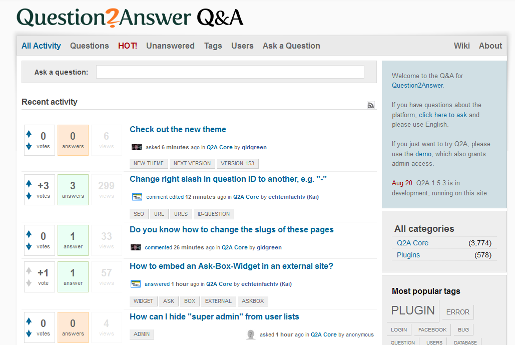
1. activity site: Is the [Views] box necessary? 3 boxes in a row makes it feel a bit too big. Most important is answers, then votes of the community, views is kind of secondary information and could have another position.

2. We should float the status "answered by..." etc. to the left, as it was before.

Screenshot with changes:

changes


Added:

3. The contrast between background-color and qa-main-wrapper is a bit too weak, we cannot see where it starts/ends. Instead of background:#fafafa I suggest #eeeeee or the recent one: #cfd1c4

4. There could be a separator between single answers. Not easy to see where it starts and ends.

5 . just to recall my suggestions from Jun 18


Overall, very nice and smooth design.

by
Thanks for your comments. I think it's late to make major changes like these, but they will be easy to do in the CSS for anyone who wants to customize it. Mainly I am interested in any bugs or glitches on certain pages.
by
BTW, you can disabled view count from Admin settings.
0 votes
by
I know this is probably a bit late and not all that useful, but I prefer the theme as it is, ugly as it is.  Strange to say :)

The vote buttons look fugly, it's too white, padding is funky, and it's got shadows in both corners... lots of work must have gone into it, but it seems far too taste-specific to be the stock theme.  Just two cents.
by
edited by
Well you are of course entitled to your opinion :) Anyway the old theme will always remain available under the name "Classic".
by
edited by
I actually got the same thought as Noah. However, I also remember - when not knowing q2a and searching for a good forum software - I hesitated to take q2a just because of the design... now I am very happy being with you. This in mind, I'd suggest to use a new theme.

But right, please keep the old theme available, I got used to it as well :)
Kai
–2 votes
by
edited by

I'll keep this updated in case I find something else.

Problems found so far:

Are the table borders supposed to be showing? It looks alright in users page but not so much in popular tags.

Something from the new theme leaked to the old one.

by
You are right and so border removed. will take affect in next update by Gideon.
–1 vote
by
edited by

Looks like this is live on the site now. I'll post my thoughts. Other opinions are available :D

  • Overall it's good and an improvement over the old theme.
  • I much preferred the old font size for questions/answers (14px?). The current size seems a bit small.
  • Bug: the font size of the editors does not match what is actually displayed. In the WYSIWYG editor it's too small, and in the plain text box for comments it's way too big! So IMO we should have 12px for the comments box and 14px for the WYSIWYG.
  • Bug: Lines appear in the CKeditor when you scroll, in Google Chrome. Screenshot here.
  • Tags are in uppercase, is this intentional? I preferred lowercase.
  • The voting arrows are too small and difficult to click. Also, you can see the + and - in them. Try color:transparent.
  • I'm not sure about every post having its own box round it with a border. Seem slike there are too many borders, maybe just horizontal lines between posts?
  • I think the text colour for questions/answers is a bit too light. Maybe make it #333 or #444 instead of #666. The comments can be left as they are, as they are less important.
  • The zebra striping on comments feels a little too dark. I'm not sure it's even necessary given the borders but maybe go to #FAFAFA?
  • Question titles (in H1) seem a little small too. Even the size of the vote numbers is bigger than the title ;)

Is the main site going to be updated with a similar style to this theme?

This blockquote style is waaay too big!

by
Sounds good. Q2A 1.5.4 should come out in late Nov / early Dec. It would be great to have the theme tweaks available first, so people could test it.
by
Okay I will start to work on and get back to you..
by
One more issue. On this comment box, in Chrome if you try to resize the box it goes a bit crazy and sluggish. I just tested and it's due to the transition property.

I'd suggest turning transitions off on everything that doesn't need it, just put the properties you want to transition (e.g. border,color,box-shadow on this I think).

Also, IE only supports transitions without the vendor prefix so you can get rid of the "-ms-". And AFAIK you shouldn't put transition rules on the :focus selector, just put the styles you are changing.
by
Going through all comments and finalizing the list of changes and modifications. Once done I will post here.
0 votes
by
I'm posting another answer to raise an issue I've found.

When the answer page is locked to registered users, the message displayed saying "please, login or register to view the answer page" is using the same layout as Pixel n Grain - Light Version. Is that intentional? Because it doesn't fit very well with the Snow theme.
by
I will check and possibly will be fixed.
0 votes
by
edited by

So here are the list of changes for SNOW theme for next version 1.5.4 of Question2Anser


  • Body background color #efefef
  • Voting box make little highlighting
  • Voting button make more larger
  • Removed + - sign from voting button
  • Font size and color to 14px and #222
  • WTSUWIG text matching with the body and comment box.
  • Removed border from all answer and added bottom border to separate them.
  • Comment odd even styling look modification
  • Question page title heading make it larger 22px
  • Blockquote size and look change
  • Change login box design
  • Change login or register from red color to theme
  • Question list separation by border and padding
  • tag text case from uppercase to normal
  • vote image change (only size).

I have tried to update according to all comment as much as possible. Please let  me know if I missed anything, I wil try to make it works if possible before Gideon luanch 1.5.4


by
Any possibility to remove the top bar ( questions/users/categories/unanswered ) if none is selected ?
...