By running Google’s Mobile-Friendly Test with this post:
https://www.question2answer.org/qa/78542/mobile-friendly-errors-in-google-search-console
I can see it throws these errors:
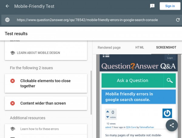
1) Clickable elements too close together
2) Content wider than screen
As for the first issue, I’ve picked out some of the things that (I think) are causing Google to trow this error message:
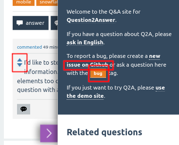
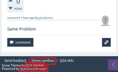
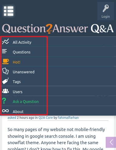
As for the second issue, I think we might need to tweak the sidebar a little bit.
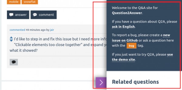
But It’d be helpful if you (other users are also welcome) can report back some others I haven’t spotted yet. Could you please click on "Clickable elements too close together" and “Content wider than screen” in Google’s Search Console and expand your question with screenshots of what it showed?
Update 2019-10-15:
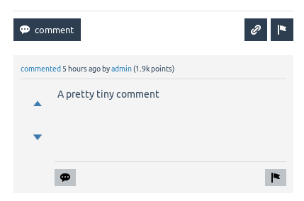
Well, I don’t think It’s a good layout for these voting buttons on comments but they follow Google’s rules. What do you think? What about the vote count?