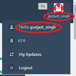
When I click user avatar in top menu (in SnowFlat theme) then a menu drops down. At this point two user names show which seems to be very awkward. I am comparing it to big social network sites, and there we don't see any username till we enter the profile of the user. Shouldn't this be done in Q2A?

Firstly, the username which shows with user avatar (in SnowFlat) can be removed because then box which hold the username and user avatar tends to be of different size as per username. This is not a big problem in desktop but it is awkward for mobile users. A simple user avatar would be good which normally all big social sites offer.
Secondly, if we click user avatar in top menu then dropdown menus shows, which is having the first field as "Hello user_name", this thing is also very much creepy to me (just my personal view), a simple word "Profile" would suit much better there. Isn't it??
Please share your views on this.