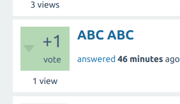
How things are handled between the votes and the answer count is indeed confusing. The votes sometime refer to the answer and sometimes they refer to the question. Which one is used depends on the URL accessed but, aside from that, there is no way to tell which is which.
The best answer concept is color-coded in the answer count box, which is not shown in that section. Even if you show it, you will have to change the meaning in that URL (again) and it should reflect whether the given answer has been selected rather than if the question has an answer (not necessarily that answer) selected. It would be even more confusing because the box will state "X answers" which will suggest a general information about the question, so if it is green, it will generate the impression the question itself has an accepted answer.
So the answer count box seems not to be the best way to go here. Probably painting the vote box will be better as it contains the votes from the answer. The bad thing about this approach is that Q2A is not ready to paint that box and will require some code in the theme. In order to do so, follow these steps.
1. Edit file qa-theme/<your-theme>/qa-theme.php
2. Add (or merge) the following function:
public function initialize() {
  parent::initialize();

  if ($this->template !== 'user-answers' || empty($this->content['q_list']['qs'])) {
    return;
  }

  foreach ($this->content['q_list']['qs'] as &$question) {
    if ($question['raw']['selchildid'] !== $question['raw']['opostid']) {
      continue;
    }
    if (!isset($question['classes'])) {
      $question['classes'] = '';
    }
    $question['classes'] .= ' mark-as-selected';
  }
}
3. Edit file qa-theme/<your-theme>/qa-styles.css
4. Append the following CSS selector:
.mark-as-selected .qa-voting {
  background-color: #b4d7b4;
}
It should look like this:

It looks decent enough, IMO, and you can select a better color, rather than trusting my limited design skills :)